Checkout, Unclogged: From Cash Wraps to One Click

In the late nineteenth century, the department store cash wrap became the final scene of retail: a counter where goods, money, receipts, and customer confidence met. A century later, the same commercial tension moved onto a screen. The queue became a form, the cashier became a payment gateway, and the last few metres between desire and ownership became a sequence of fields, redirects, and decisions.
Today, Shopify checkout extensibility and Shop Pay represent the latest settlement in that long history. The objective is not to decorate checkout. It is to remove the friction that accumulated as commerce moved from shop floor to browser, while preserving the trust and flexibility that make a brand feel like itself. This is why checkout looks the way it does today, and why the strongest Shopify builds treat the final click as a product experience rather than an administrative afterthought.
Before the browser: the cash wrap as controlled friction
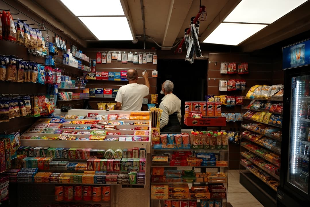
Physical retail once concentrated risk at a single, visible point. The customer could inspect the product, ask a question, see the price, and then approach the counter with most objections already resolved. The cashier handled payment, but the store’s layout had performed much of the conversion work beforehand.
E-commerce separated those functions. Product discovery happened on one page, delivery information appeared later, payment took place elsewhere, and reassurance often arrived only after a customer had entered personal details. As online retail matured through the 1990s and 2000s, checkout inherited the logic of internal systems rather than the logic of a well-run shop: more fields, more rules, more opportunities for uncertainty.
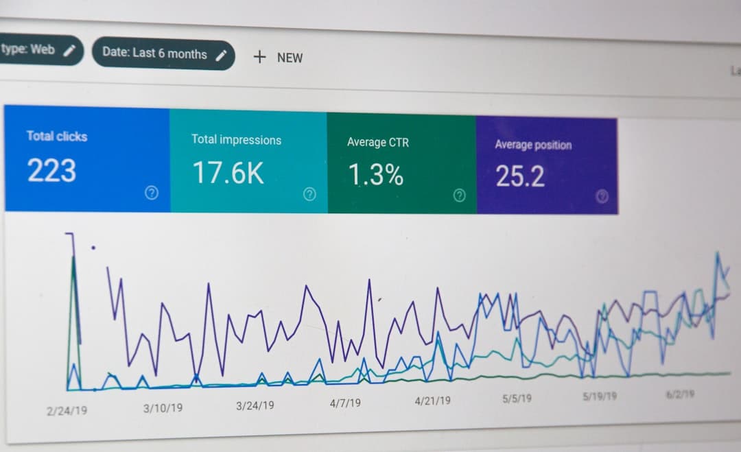
The result remains measurable. The Baymard Institute’s current checkout research places average documented cart abandonment at 70.22 percent, while its 2025 survey found that 39 percent of shoppers abandoned because extra costs were too high, 19 percent because an account was required, and 18 percent because the process was too long or complicated. Not every abandoned cart represents a lost sale, since browsing and comparison are part of shopping, but the pattern shows where avoidable friction survives.
The 2000s and 2010s: more choice, more checkout clutter
The next era added convenience in fragments. Guest checkout reduced account pressure. Digital wallets shortened payment entry. Address lookup, saved cards, mobile browsers, and alternative payment methods each solved a genuine problem, yet the accumulated result could still feel like a corridor filled with doors.
This history explains a persistent misconception: that checkout conversion is chiefly a matter of adding payment options or applying a brighter button. In practice, the customer is judging several things at once. Is the total cost visible? Is delivery credible? Is the merchant trustworthy? Can the order be changed? Will the mobile layout behave? The Baymard findings note that an ideal checkout can use as few as 12 to 14 form elements, while the average US checkout displays 23.48 elements by default. Design, content, performance, and payment infrastructure therefore meet at the same narrow point.
For a DTC brand, the implications are especially sharp. A fashion customer may need size and delivery reassurance; a furniture customer may need freight clarity and returns information; a lifestyle brand may need an elegant path that does not flatten its identity into a generic transaction. The checkout must reduce hesitation without removing useful context.
2021 onward: Shop Pay turns identity into infrastructure
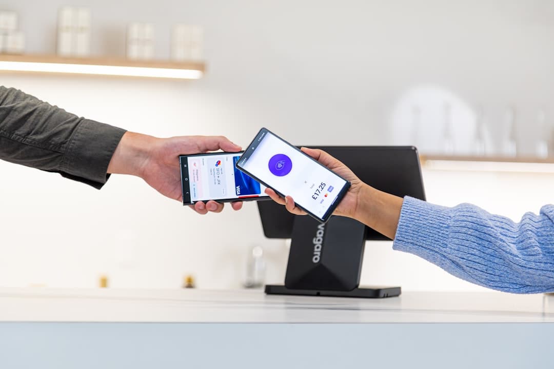
Shop Pay emerged from this pressure for speed by treating customer identity as a reusable checkout asset. Once a shopper has saved relevant details, the next purchase can require substantially less repetition than a conventional guest flow. Shopify states that Shop Pay can be up to four times faster than guest checkout, while its enterprise research reports conversion advantages that vary by device, merchant, and comparison set. Such figures are Shopify claims, not universal guarantees, but the underlying mechanism is clear: fewer keystrokes mean fewer chances for interruption.
That mechanism matters most on mobile, where small keyboards, unstable attention, and crowded interfaces magnify every unnecessary field. Shop Pay also carries familiarity across participating Shopify stores, which can reduce the psychological cost of entering payment information into an unfamiliar site. The brand still owns the storefront and the relationship, while the payment layer benefits from an established, recognisable system.
This is not a reason to make every checkout identical. It is a reason to distinguish the parts that should be familiar from the parts that should remain distinctive. Product reassurance, delivery language, tone, visual hierarchy, and post purchase communication can express the brand. Payment completion should feel dependable.
2023 and 2024: checkout.liquid gives way to extensibility
The architectural shift became explicit when Shopify retired the old model of editing checkout directly. According to the Shopify developer changelog, checkout.liquid stopped working for in checkout pages on August 13, 2024, with checkout extensibility replacing it for Shopify Plus merchants.
The change reflects a broader platform lesson. Directly modifying a core transaction template can offer control, but it also creates maintenance debt, compatibility risk, and a difficult upgrade path. Checkout extensibility moves customisation into app based extensions and supported APIs. Shopify’s checkout documentation describes extensions for customising parts of checkout, while Checkout UI Extensions define where interface components can appear and what capabilities they receive. Shopify Functions handle selected backend logic, including checkout related rules, through a supported execution model.
For merchants, the practical benefit is not merely technical neatness. Extensibility permits useful, bounded interventions: delivery notes, loyalty information, product recommendations, validation, custom fields, and contextual reassurance, subject to Shopify’s available surfaces and plan requirements. It also makes the experience more upgrade safe and integrated with Shop Pay, rather than forcing a choice between customisation and a fast accelerated checkout.
Why Shopify checkout now wins the sale
The advantage is cumulative. Shopify supplies a tested commerce foundation, Shop Pay compresses repeat payment effort, and checkout extensibility provides controlled room for brand and operational requirements. Together, they address the three historical weaknesses of online checkout: uncertainty, repetition, and brittle custom code.
The strongest implementation begins before development. Analytics should identify where shoppers hesitate, customer service logs should reveal recurring questions, and the merchandising team should clarify which cross sells or assurances genuinely help. A design system can then carry typography, colour, spacing, and tone into the supported checkout surfaces without pretending that checkout is another campaign landing page.
Performance remains part of the argument. Extra scripts, excessive widgets, unclear error states, and poorly prioritised information can return a fast payment method to a slow experience. Testing should cover mobile, discount codes, express payments, failed payments, shipping variations, tax, inventory changes, accessibility, and post purchase states. A checkout that converts only under ideal conditions is not a finished checkout.

The present: fewer obstacles, better judgement
For growth minded brands, the historical lesson is straightforward. The cash wrap worked because it gathered confidence at the moment of payment; the best digital checkout does the same without recreating the queue. Shop Pay handles familiar payment effort, while checkout extensibility allows the business to add only the information and functionality that earn their place.
That balance is where a design led Shopify partner such as Mifzi can matter. Its work across fashion, home, lifestyle, and consumer commerce places checkout within a wider system of brand identity, UX, development, performance, and growth marketing, rather than treating it as an isolated template. The result should be measured not by how much has been added, but by how confidently the customer can finish.
For you, the implication is practical: audit the final path as seriously as the homepage, keep Shop Pay visible where it suits the audience, use extensibility for purposeful interventions, and let evidence decide what stays. The sale is still won at the cash wrap, only now the cash wrap is a carefully designed few seconds on a phone.