Seconds to Cents: How Site Speed Won E-commerce
In the early years of online retail, a product page could take half a minute to appear and still feel like a technological achievement. Then broadband spread, smartphones became storefronts, and the delay stopped being a technical inconvenience and became a commercial decision. By the time mobile commerce became routine, the browser had acquired a shorter memory: shoppers compared, abandoned, and returned less readily when an experience felt slow.
The present is the result of that long adjustment. Speed now sits where merchandising, search visibility, and conversion meet. A Shopify store is no longer judged only by whether it looks distinctive or whether checkout works. It is judged by how quickly the first meaningful product appears, how steadily the page holds its shape, and how soon the interface responds. This is why modern e-commerce performance looks less like a final polish and more like an architectural discipline.
Before the metrics: when load time became lost revenue
For much of the 2000s, web design treated performance as a matter of engineering hygiene. The commercial case sharpened as mobile browsing grew. Google’s mobile research, collected in its Milliseconds Make Millions report, demonstrated that small increases in load time could alter browsing behaviour and reduce the likelihood of purchase.
The cause and effect was straightforward. Every additional script, oversized image, tracking request, and promotional animation competed for the same limited attention and network capacity. A shopper waiting for a product gallery was not simply waiting for pixels. That shopper was losing confidence in the store’s reliability, and confidence is difficult to recover once another tab has opened.
The scale of the problem remains visible in the 2025 Web Almanac from HTTP Archive, which reports a median mobile home page weight of 2.6 MB, with images accounting for the largest share of bytes. The web became visually richer, but its underlying economics remained unforgiving: more media created more opportunity to sell, and more opportunity to delay the sale.

2010s to today: from page speed to Core Web Vitals
The next shift came when performance stopped being described by one broad number. Google’s Core Web Vitals guidance established three practical measures of experience: Largest Contentful Paint, or LCP, for the arrival of the main content; Interaction to Next Paint, or INP, for responsiveness; and Cumulative Layout Shift, or CLS, for visual stability.
The thresholds explain the priorities. A good LCP is 2.5 seconds or less, a good INP is 200 milliseconds or less, and a good CLS is 0.1 or less. These are not abstract laboratory scores. They describe whether a customer sees the hero product promptly, whether a filter or add-to-cart action responds, and whether a button moves just as a thumb reaches it.
The numbers also explain why performance remains unfinished business. According to the 2025 Web Almanac performance chapter, only 48% of mobile pages passed all three Core Web Vitals in 2025, although the mobile pass rate had risen from 36% in 2023. The improvement is real, but the majority still falls short, which means a well-built store can gain an advantage without resorting to theatrical design tricks.
This is why site speed looks the way it does today: the industry moved from measuring how quickly a document loaded to measuring whether a human could use it without friction.
The Shopify stack: from template decoration to deliberate architecture
Shopify made commerce implementation more accessible, but accessibility did not remove architectural trade-offs. A theme can be visually edited in minutes while accumulating years of scripts, app embeds, unused sections, and third-party requests. The storefront then becomes a record of every past marketing decision, even when those decisions no longer serve the customer.
Shopify’s own theme performance guidance recommends building primarily with HTML and CSS, keeping JavaScript from becoming necessary for basic functions, and using purpose-built themes. Its app extension documentation further explains how scripts can be loaded only on relevant pages, reducing the cost of apps that do not belong everywhere.
The strongest front-end stack therefore begins with restraint. Liquid and semantic HTML handle the structure; modern CSS handles layout and interaction where possible; JavaScript is reserved for behaviour that genuinely improves shopping. Where a headless storefront is justified, Shopify’s Hydrogen framework can support React-based experiences, but the additional freedom also creates additional responsibility for rendering strategy, caching, data fetching, and JavaScript size. Headless is an architectural choice, not a synonym for fast.
A design-led agency such as Mifzi operates at this intersection because visual distinction and performance are not opposing objectives when the system is planned before the decoration. Strategy clarifies what deserves prominence, design establishes the hierarchy, and development turns that hierarchy into a measured interface rather than a pile of effects.

Media strategy: the product image as both salesperson and bottleneck
E-commerce cannot remove images from the sales process. Fashion depends on drape and detail; furniture depends on proportion and material; lifestyle products depend on context. The answer has therefore shifted from fewer images to more intelligent delivery.
The first principle is dimensional honesty. Images should be exported close to their largest rendered size rather than uploaded at several times the required resolution. Responsive image markup can then serve an appropriate variant to each viewport. Modern formats such as WebP and AVIF generally reduce file size, while compression should preserve the details that affect purchase confidence and discard weight that shoppers cannot perceive.
The second principle is sequencing. The largest above-the-fold product or campaign image should be discovered early, while below-the-fold galleries, reviews, and editorial media can load lazily. Dimensions should be reserved in the layout so that images do not create shifts, and video should not begin competing with the primary product image before the page has established its basic usefulness.
Shopify’s performance recommendations for online stores place image sizing and format alongside app evaluation because the problem is rarely one oversized file alone. It is usually the combined effect of media, scripts, fonts, and embedded services arriving without a hierarchy.
The measurement era: field data over a perfect laboratory score
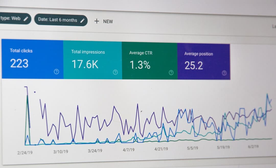
A successful performance programme now combines controlled testing with real-user data. Lighthouse can reveal a blocking script on a test device, while Chrome’s CrUX documentation shows how actual visitors experience a page across devices and connections. Both views matter because a fast desktop test can conceal a slow mobile product page, and a homepage improvement can conceal a failing checkout journey.
The useful process is continuous but not frantic: establish a baseline, identify the largest contributors to LCP, INP, and CLS, fix the highest-value constraint, then measure revenue and behaviour alongside technical scores. App inventories, template audits, image reports, and checkout funnel data make the diagnosis commercial rather than cosmetic.
What the next second now means
The history leaves a clear implication. Speed is not a race to make every page empty; it is the practice of making every requested element arrive in the order that supports a decision. For a growth-minded brand, that means treating the storefront as a connected system of brand, content, code, media, and measurement.
If the next Shopify build begins with that history in mind, you can protect the first impression without flattening the creative idea, choose a front-end stack according to the customer journey rather than fashion, and make every image earn its bandwidth. The result is not merely a faster page. It is a store in which fewer seconds stand between interest and action, and where performance becomes part of the brand’s credibility rather than an emergency discovered after launch.